Tailwind CSS v3.3: Extended color palette, ESM/TS support, logical properties, and more
- Date
 Adam Wathan

Tailwind CSS v3.3 is here — bringing a bunch of new features people have been asking for forever, and a bunch of new stuff you didn’t even know you wanted.
- Extended color palette for darker darks: New darker 950 shades for every color.
- ESM and TypeScript support: Write your config file using ESM or TypeScript.
- Simplified RTL support with logical properties: Build layouts that adapt to different directions.
- Fine-tune gradient color stop positions: Specify exactly where you want each color stop to go.
- Line-clamp out of the box: Truncate multi-line text without a plugin.
- New line-height modifier: Set your font-size and line-height with one class.
- CSS variables without the var(): New shorthand syntax for arbitrary values.
- Configurable
font-variation-settings: Baked directly into yourfont-*utilities. - New
list-style-imageutilities: So you can use horrible clip art for bullet points. - New
hyphensutilities: For fine-tuning hyphenation behavior. - New
caption-sideutilities: Title your tables with style.
That covers the most exciting stuff, but check out the release notes for an exhaustive list of every single little improvement we’ve made since the last release.
Upgrading your projects is as easy as installing the latest version of tailwindcss from npm:
npm install -D tailwindcss@latestYou can also try out all of the new features on Tailwind Play, right in your browser.
Extended color palette for darker darks
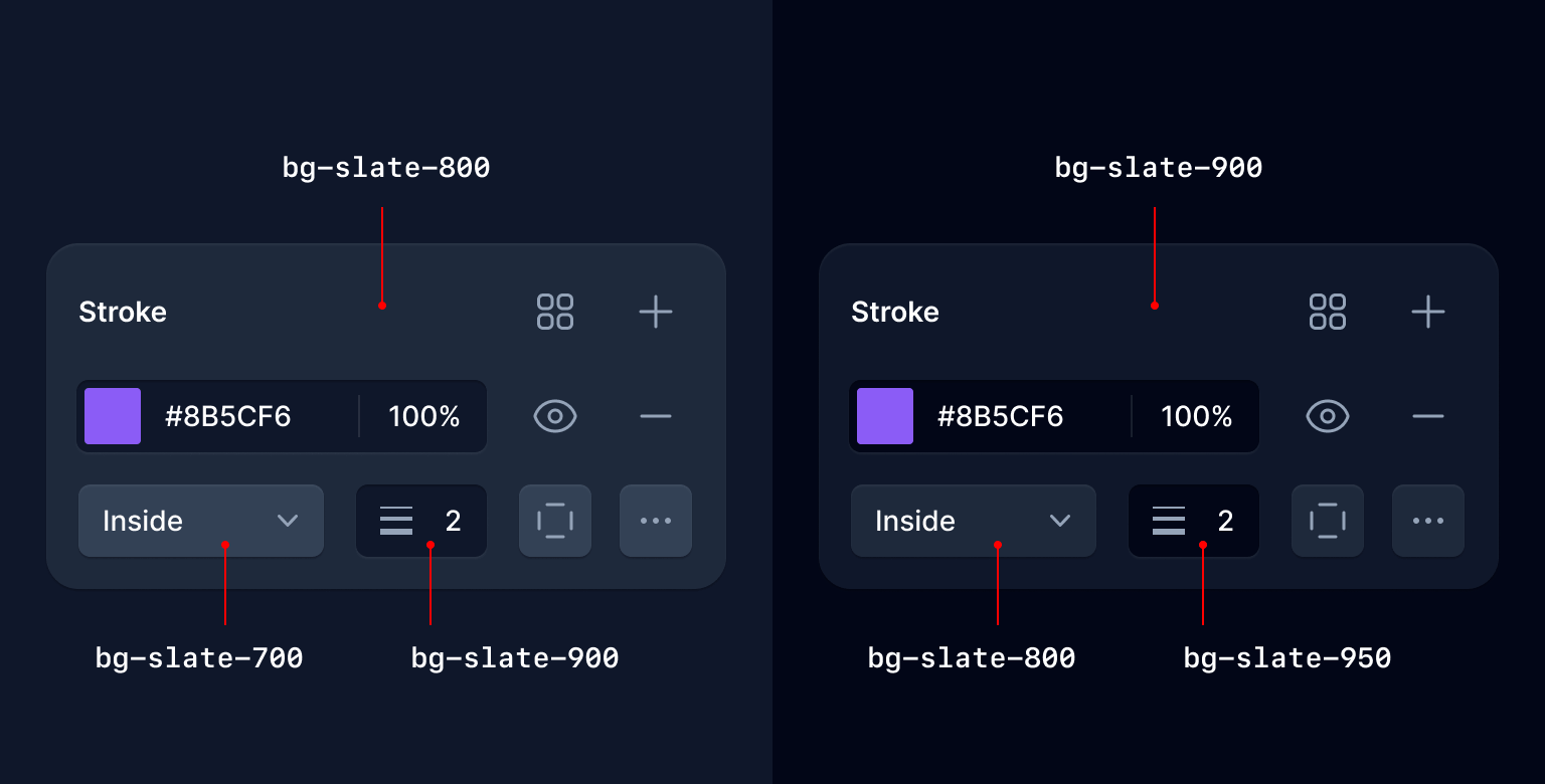
One of the most common feature requests we’ve had over the years is to add darker shades for every color — usually because someone is building a dark UI and just wants more options down in that dark end of the spectrum.
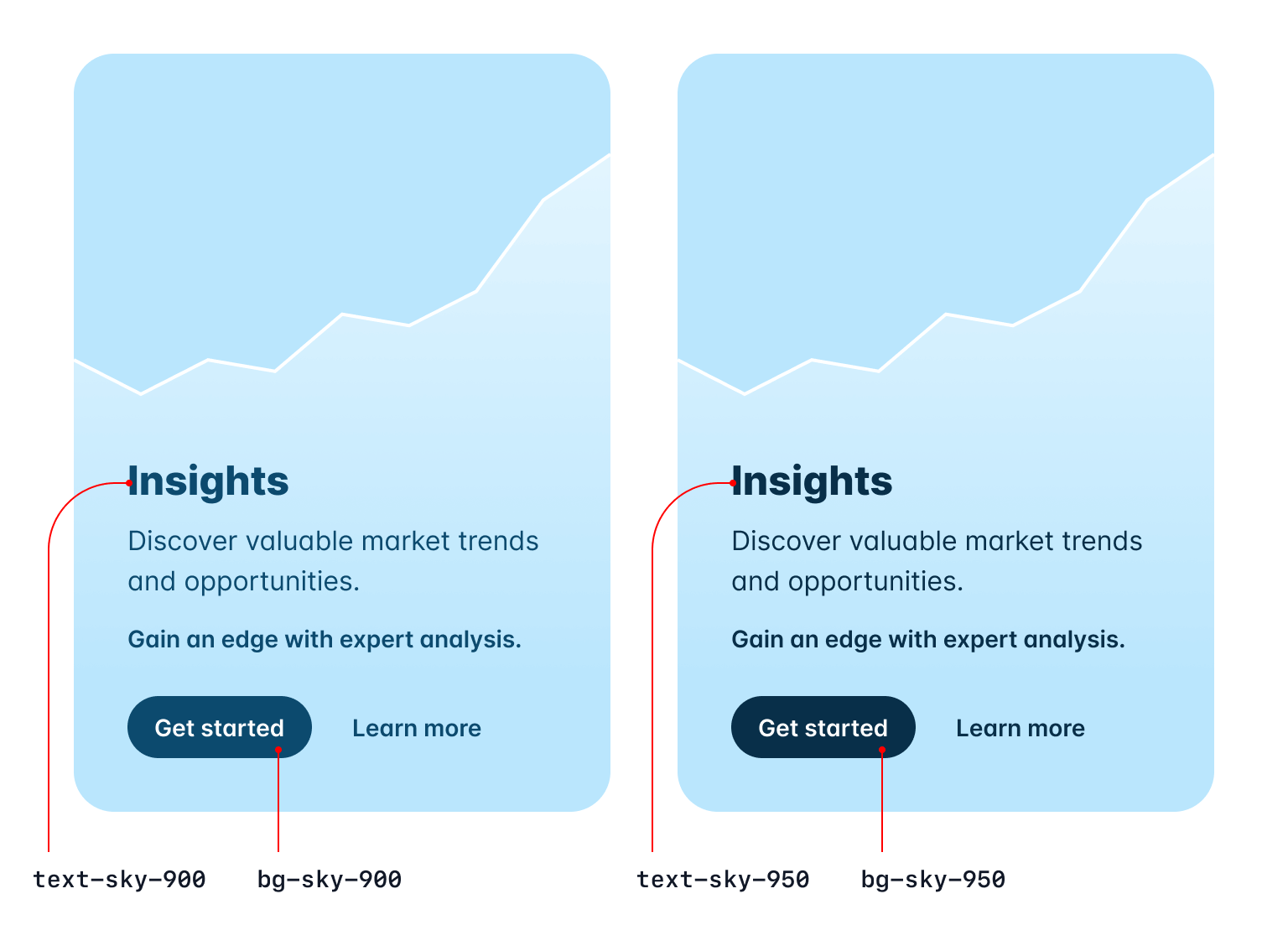
Well wish granted — in Tailwind CSS v3.3 we’ve added a new 950 shade for every single color.
In the grays they act as basically a tinted black, which is great for ultra dark UIs:

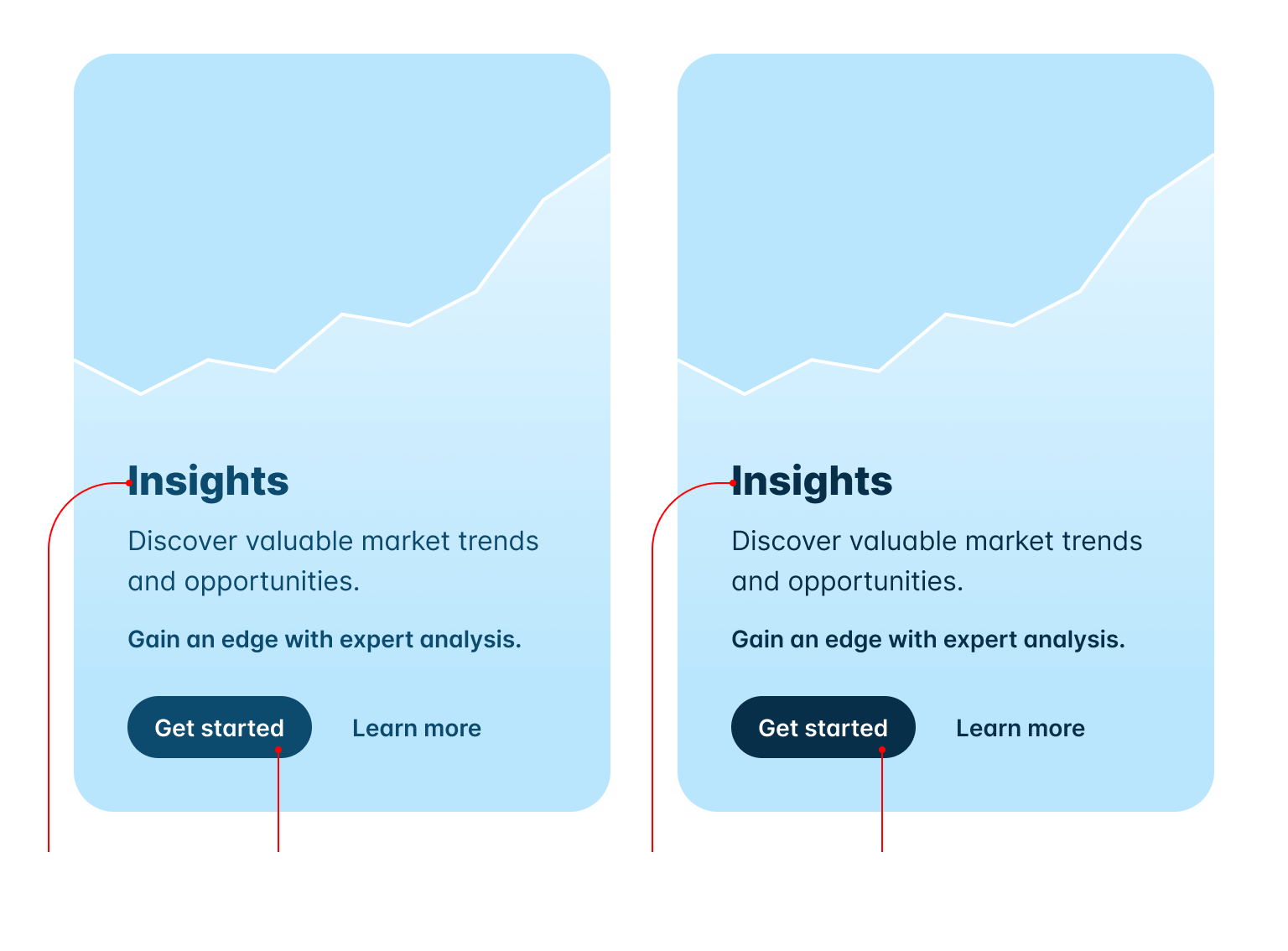
And in the rest of the color spectrum we optimized 950 for high contrast text and tinted control backgrounds:

Believe it or not the hardest part about this project was convincing ourselves to be okay with having 11 shades per color. Trying to make that look good in the color palette documentation was a nightmare.
Also pour one out for the 50 shades of gray jokes we used to be able to make.
ESM and TypeScript support
Now you can configure Tailwind CSS in ESM, or even in TypeScript:
/** @type {import('tailwindcss').Config} */
export default {
  content: [],
  theme: {
    extend: {},
  },
  plugins: [],
}
import type { Config } from 'tailwindcss'

export default {
  content: [],
  theme: {
    extend: {},
  },
  plugins: [],
} satisfies Config
When you run npx tailwindcss init, we’ll detect if your project is an ES Module and automatically generate your config file with the right syntax.
You can also generate an ESM config file explicitly by using the --esm flag:
npx tailwindcss init --esmTo generate a TypeScript config file, use the --ts flag:
npx tailwindcss init --tsA lot of people assume this is easy because they’re writing their own code in ESM already (even if it’s being transpiled by their build tool) but it’s actually pretty tricky — we literally have to transpile the config file for you on the fly.
It’s a bit easier to understand why this has to happen when you think of the TypeScript case, because of course Tailwind is distributed as JavaScript, and it can’t magically import an uncompiled TypeScript file.
We’re handling this with the wonderful jiti library under the hood, and using Sucrase to transpile the code with the best possible performance while keeping the installation footprint small.
Simplified RTL support with logical properties
We’ve made it possible to style multi-directional websites using our LTR and RTL variants for a while, but now you can use logical properties to do most of this styling more easily and automatically.
Using new utilities like ms-3 and me-3, you can style the start and end of an element so that your styles automatically adapt in RTL, instead of writing code like ltr:ml-3 rtl:mr-3:
Left-to-right

Tom Cook
Director of Operations
Right-to-left

تامر كرم
الرئيس التنفيذي
<div class="group flex items-center"> <img class="shrink-0 h-12 w-12 rounded-full" src="..." alt="" /> <div class="ltr:ml-3 rtl:mr-3"> <div class="ms-3"> <p class="text-sm font-medium text-slate-700 group-hover:text-slate-900">...</p> <p class="text-sm font-medium text-slate-500 group-hover:text-slate-700">...</p> </div> </div><div class="group flex items-center"> <img class="shrink-0 h-12 w-12 rounded-full" src="..." alt="" /> <div class="ltr:ml-3 rtl:mr-3"> <div class="ms-3"> <p class="text-sm font-medium text-slate-300 group-hover:text-white">...</p> <p class="text-sm font-medium text-slate-500 group-hover:text-slate-300">...</p> </div> </div>
We’ve added new logical property utilities for inset, margin, padding, border-radius, scroll-margin, and scroll-padding.
Here’s a full list of all of the new utilities we’ve added and what they map to:
| New class | Properties | Physical counterpart (LTR) |
|---|---|---|
start-* | inset-inline-start | left-* |
end-* | inset-inline-end | right-* |
ms-* | margin-inline-start | ml-* |
me-* | margin-inline-end | mr-* |
ps-* | padding-inline-start | pl-* |
pe-* | padding-inline-end | pr-* |
rounded-s-* | border-start-start-radiusborder-end-start-radius | rounded-l-* |
rounded-e-* | border-start-end-radiusborder-end-end-radius | rounded-r-* |
rounded-ss-* | border-start-start-radius | rounded-tl-* |
rounded-se-* | border-start-end-radius | rounded-tr-* |
rounded-ee-* | border-end-end-radius | rounded-br-* |
rounded-es-* | border-end-start-radius | rounded-bl-* |
border-s-* | border-inline-start-width | border-l-* |
border-e-* | border-inline-end-width | border-r-* |
border-s-* | border-inline-start-color | border-l-* |
border-e-* | border-inline-end-color | border-r-* |
scroll-ms-* | scroll-margin-inline-start | scroll-ml-* |
scroll-me-* | scroll-margin-inline-end | scroll-mr-* |
scroll-ps-* | scroll-padding-inline-start | scroll-pl-* |
scroll-pe-* | scroll-padding-inline-end | scroll-pr-* |
These should save you a ton of code if you regularly build sites that need to support both LTR and RTL languages, and you can always combine these with the ltr and rtl variants when you need more control.
Fine-tune gradient color stop positions
We’ve added new utilities like from-5%, via-35%, and to-85% that let you adjust the actual position of each color stop in your gradients:
<div class="bg-gradient-to-r from-indigo-500 from-10% via-purple-500 via-30% to-pink-500 to-90% ...">
  <!-- ... -->
</div>
We’ve included every value from 0% to 100% in steps of 5 out of the box, but you can of course use arbitrary values to get exactly the effect you want:
<div class="bg-gradient-to-r from-cyan-400 from-[21.56%] ...">
  <!-- ... -->
</div>
For more details, check out the gradient color stops documentation.
Line-clamp out of the box
We released our official line-clamp plugin just over two years ago and even though it uses a bunch of weird deprecated -webkit-* stuff, it works in every browser and it’s going to work forever, so we decided to just bake it into the framework itself.
Boost your conversion rate
Nulla dolor velit adipisicing duis excepteur esse in duis nostrud occaecat mollit incididunt deserunt sunt. Ut ut sunt laborum ex occaecat eu tempor labore enim adipisicing minim ad. Est in quis eu dolore occaecat excepteur fugiat dolore nisi aliqua fugiat enim ut cillum. Labore enim duis nostrud eu. Est ut eiusmod consequat irure quis deserunt ex. Enim laboris dolor magna pariatur. Dolor et ad sint voluptate sunt elit mollit officia ad enim sit consectetur enim.
 Lindsay Walton
<article>
  <div>
    <time datetime="2020-03-16" class="block text-sm/6 text-gray-600">Mar 10, 2020</time>
    <h2 class="mt-2 text-lg font-semibold text-gray-900">Boost your conversion rate</h2>
    <p class="line-clamp-3 mt-4 text-sm/6 text-gray-600">
      Illo sint voluptas. Error voluptates culpa eligendi. Hic vel totam vitae illo. Non aliquid explicabo necessitatibus unde. Sed exercitationem placeat consectetur nulla deserunt vel iusto corrupti dicta laboris incididunt.
    </p>
  </div>
  <div class="mt-4 flex gap-x-2.5 text-sm font-semibold leading-6 text-gray-900">
    <img src="..." class="h-6 w-6 flex-none rounded-full bg-gray-50" />
    Lindsay Walton
  </div>
</article>
So when you upgrade to v3.3, you can safely remove the line-clamp plugin if you were using it:
module.exports = {
  // ...
  plugins: [
    require('@tailwindcss/line-clamp')
  ]
}
Don’t let the door hit you in the ass on the way out, plugin.
Check out the new line-clamp documentation to learn more about how it all works if you haven’t played with it before.
New line-height shorthand for font-size utilities
One thing we’ve found over years and years of designing beautiful stuff with Tailwind is that we literally never set a line-height without also setting the font-size at the same time.
So inspired by our color opacity modifier syntax, we decided to make it possible to save a few characters by setting them together with a single utility:
  <p class="text-lg leading-7 ...">
  <p class="text-lg/7 ...">
    So I started to walk into the water. I won't lie to you boys, I was terrified. But
    I pressed on, and as I made my way past the breakers a strange calm came over me.
    I don't know if it was divine intervention or the kinship of all living things but
    I tell you Jerry at that moment, I <em>was</em> a marine biologist.
  </p>
You can use any value defined in your line-height scale, or use arbitrary values if you need to deviate from your design tokens:
<p class="text-sm/[17px] ..."></p>Check out the font size documentation for a few more examples.
CSS variables without the var()
In the spirit of typing less, we’ve also made it possible to omit the var() when using a CSS variable as an arbitrary value:
export function MyComponent({ company }) {
  return (
    <div
      style={{
        '--brand-color': company.brandColor,
        '--brand-hover-color': company.brandHoverColor,
      }}
      className="bg-[var(--brand-color)] hover:bg-[var(--brand-hover-color)]"
      className="bg-[--brand-color] hover:bg-[--brand-hover-color]"
    />
  )
}
That’s a pretty cool trick right there for using things like hover: with styles that come from the database or something by the way.
Configure font-variation-settings for custom font families
When using custom fonts, you’ll often want to configure things like font-feature-settings or font-variation-settings to opt-in to specific tweaks the font offers.
We’ve made it easy to do this for font-feature-settings for a while, but now you can do the same thing with font-variation-settings by providing a value for it in the sort-of options object you can plop after the font list in your config file:
module.exports = {
  theme: {
    fontFamily: {
      sans: [
        'Inter var, sans-serif',
        {
          fontFeatureSettings: '"cv11", "ss01"',
          fontVariationSettings: '"opsz" 32',
        },
      ],
    },
  },
}
In the example above we’re using a recent release of Inter that supports using the optical size axis to trigger the “Display” variation of the font, optimized for larger sizes like headlines.
New list-style-image utilities
Ever wanted to use a picture of a carrot as your list item marker? Well now you can, with the new list-image-* utilities.
- 5 cups chopped Porcini mushrooms
- 1/2 cup of olive oil
- 3lb of celery
<ul class="list-image-[url(carrot.png)] ...">
  <li>5 cups chopped Porcini mushrooms</li>
  <!-- ... -->
</ul>
We’re not going to start shipping vegetable clip art with the framework, but you can use any image you want either as an arbitrary value or configuring it in the listStyleImage section of your theme.
Check out the list style image documentation to learn more.
New hyphens utilities
Ever heard of the ­ HTML entity? Me neither until we added support for these hyphens-* utilities.
Using hyphens-manual and a carefully placed ­, you can tell the browser where to insert a hyphen when it needs to break a word across multiple lines:
Officially recognized by the Duden dictionary as the longest word in German, KraftfahrzeugHaftpflichtversicherung is a 36 letter word for motor vehicle liability insurance.
<p class="hyphens-manual ...">
... Kraftfahrzeug­Haftpflichtversicherung is a ...
</p>Maybe a code snippet like this would be useful to include as part of your unpronounceable death metal band’s press kit so the journalists don’t screw up the hyphenation in the article that finally breaks you on to the scene.
Check out the hyphens documentation to learn more.
New caption-side utilities
Another new one for me — the <caption> element! We’ve got new caption-* utilities you can use on table captions to control whether they appear at the top or bottom of the table they’re attached to.
| Wrestler | Signature Move(s) |
|---|---|
| "Stone Cold" Steve Austin | Stone Cold Stunner, Lou Thesz Press |
| Bret "The Hitman" Hart | The Sharpshooter |
| Razor Ramon | Razor's Edge, Fallaway Slam |
<table>
  <caption class="caption-bottom">
    Table 3.1: Professional wrestlers and their signature moves.
  </caption>
  <thead>
    <tr>
      <th>Wrestler</th>
      <th>Signature Move(s)</th>
    </tr>
  </thead>
  <tbody>
    <tr>
      <td>"Stone Cold" Steve Austin</td>
      <td>Stone Cold Stunner, Lou Thesz Press</td>
    </tr>
    <tr>
      <td>Bret "The Hitman" Hart</td>
      <td >The Sharpshooter</td>
    </tr>
    <tr>
      <td>Razor Ramon</td>
      <td>Razor's Edge, Fallaway Slam</td>
    </tr>
  </tbody>
</table>
Check out the caption side documentation for some more examples.
So that’s Tailwind CSS v3.3! No breaking changes, just a bunch of fun new stuff. Give it a try in your projects today by updating to the latest version with npm:
npm install -D tailwindcss@latestYep, another release without text-shadow utilities. Remember that episode of Seinfeld where Kramer tries to see how far he can drive without stopping for gas? That’s my favorite episode.


